NAME: Smart home
DATE: 2013/2015
Images courtesy: Robert Bosch GmbH
CLIENT: Bosch smart home
Role: Industrial design lead
TEAM: UI support team for the app
FAITH: LAunched in 2016
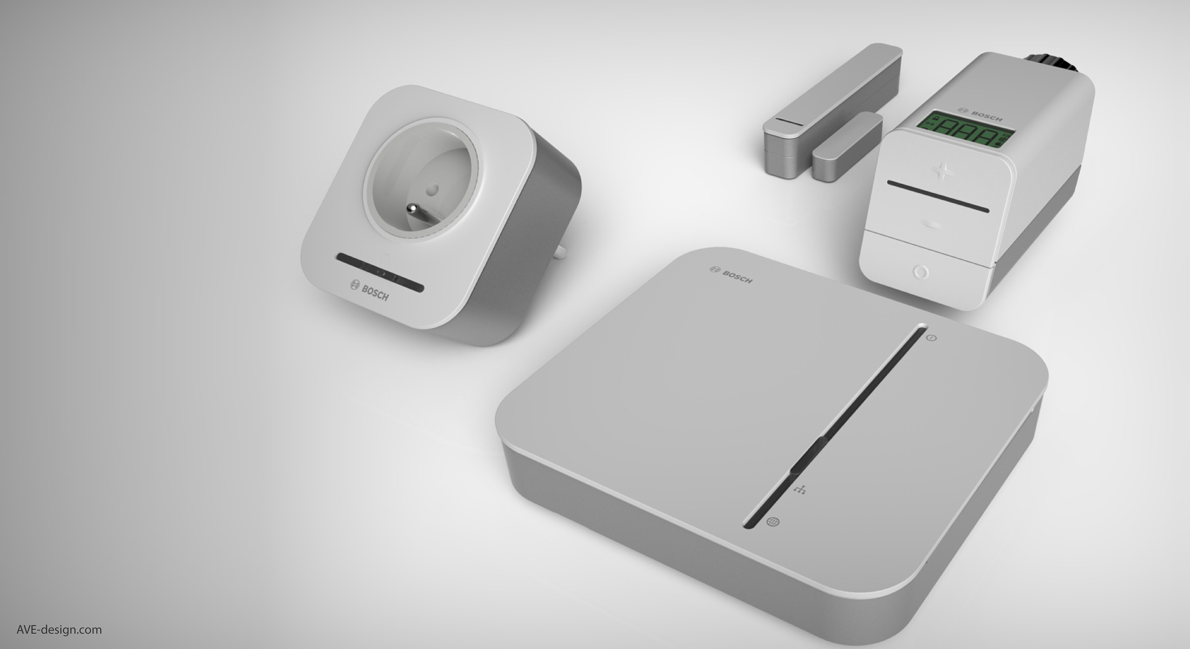
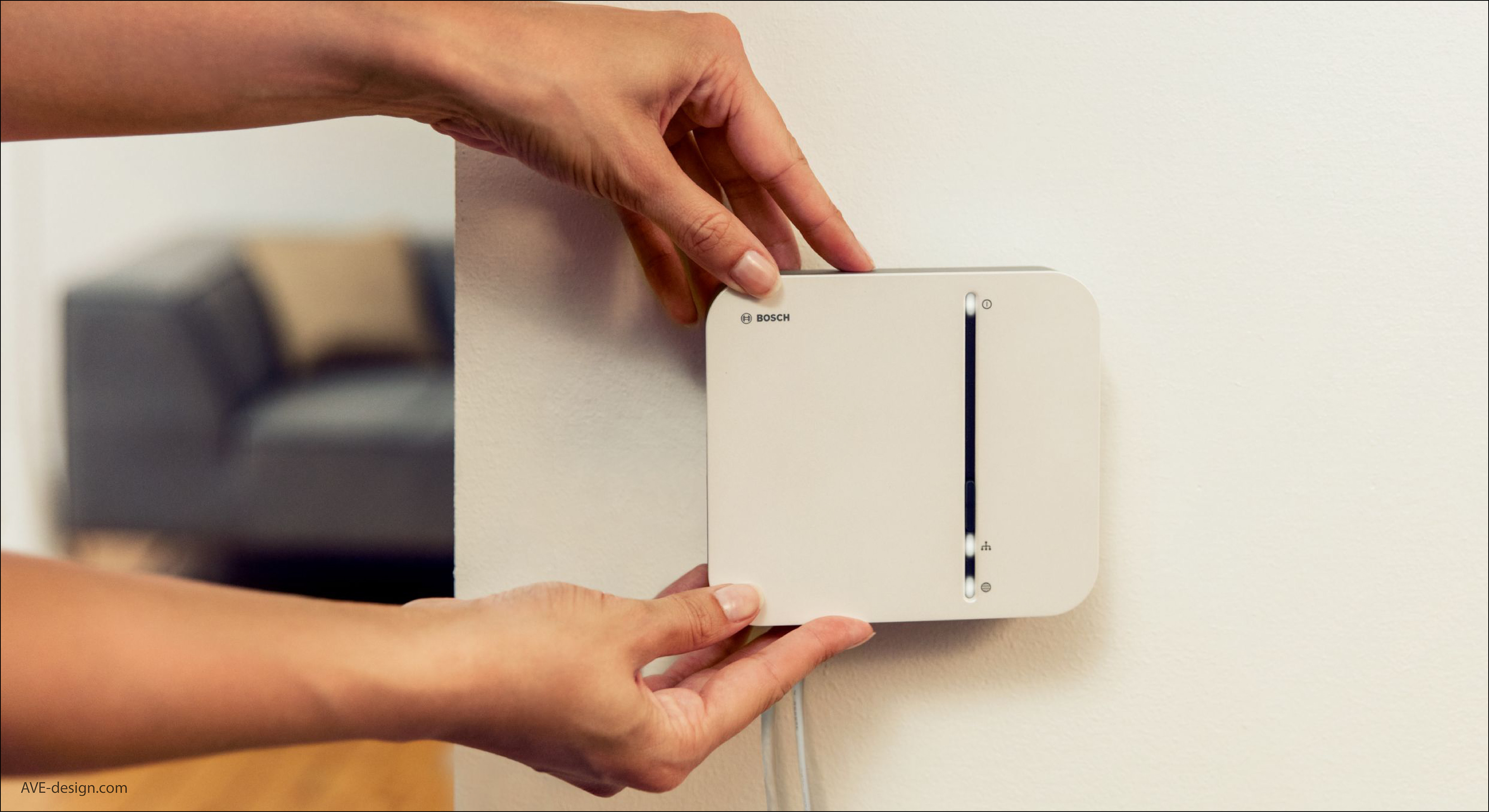
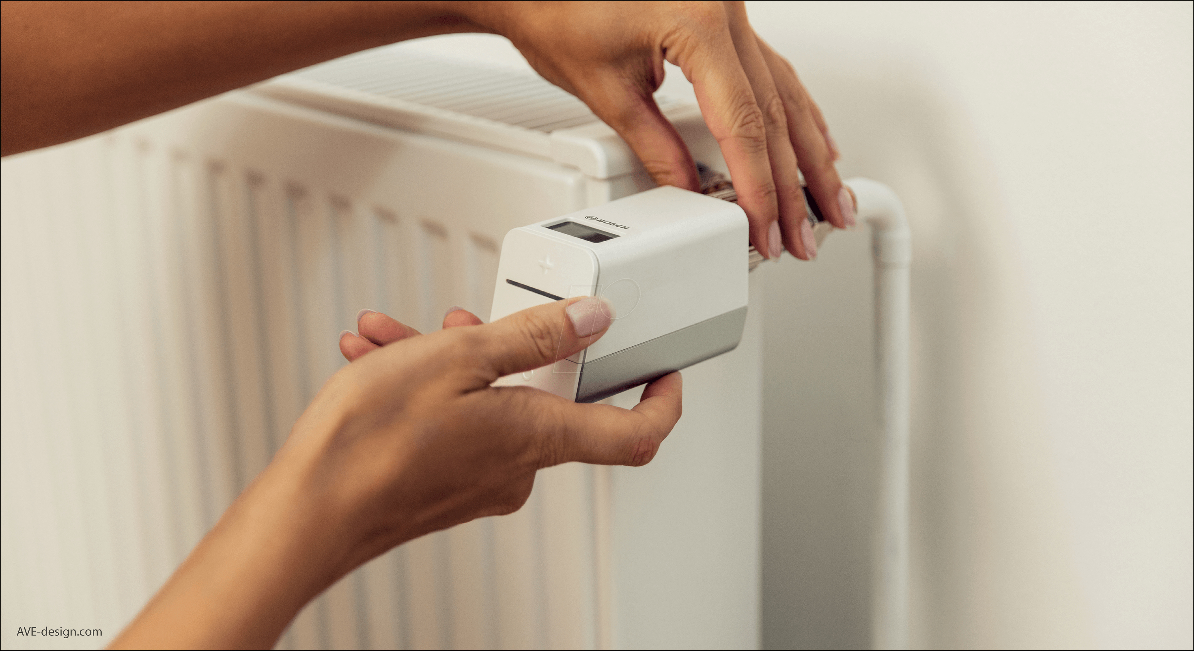
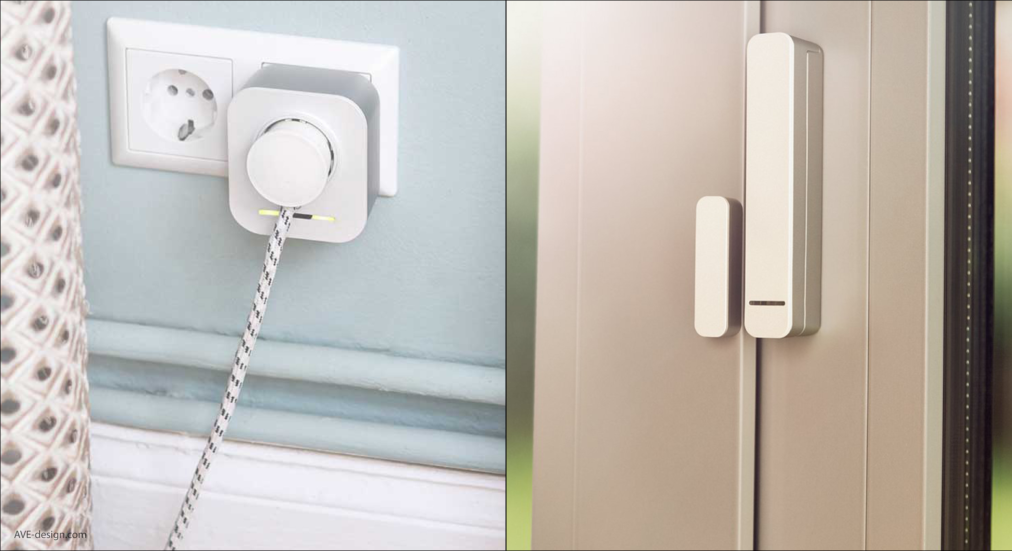
This project was a very important milestone for Bosch since it was a new portfolio of a new division that was spearheading the IoT for consumer movement. The product family consisted of a controller, thermostat, smart plug and a door sensor.
Due to short time to market and extreme cost sensitivity, it was a huge challenge to find a suitable design. I tried to create a simple and quite design language that could blend into any environment. The white interaction front was combined with a light element to focus the UI. The back housing was refined and painted metallic to stress the SMART technology.
All hardware had to fit the existing inner architecture that was previously developed. Within these hard constrains, a design was created to stand out on the market as much as possible and retain BOSCH brand values.
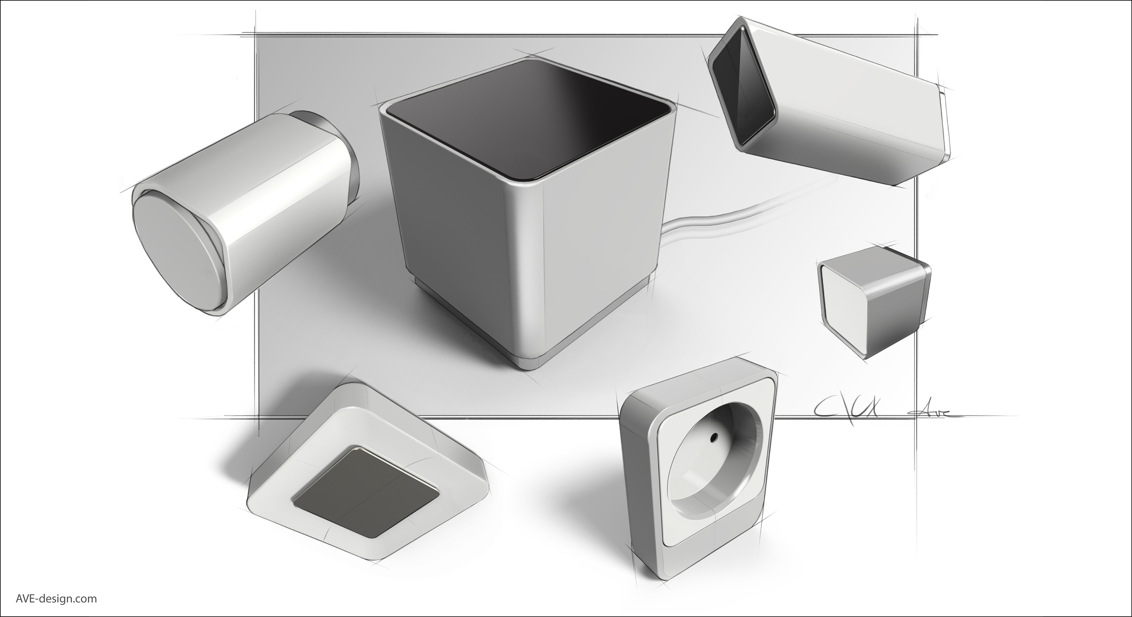
Initial sketch
In the early beginning, without knowing what product line-up, size or technology will be used, sketches were made to set a tone for the design. This style was kept consistent during the further development.
Family style
As the 4 items are very different in proportion, a key visual language was used and patented to keep the family together. A detailed rulebook helped with implementation of the design on future products (smoke detector, indoor camera)
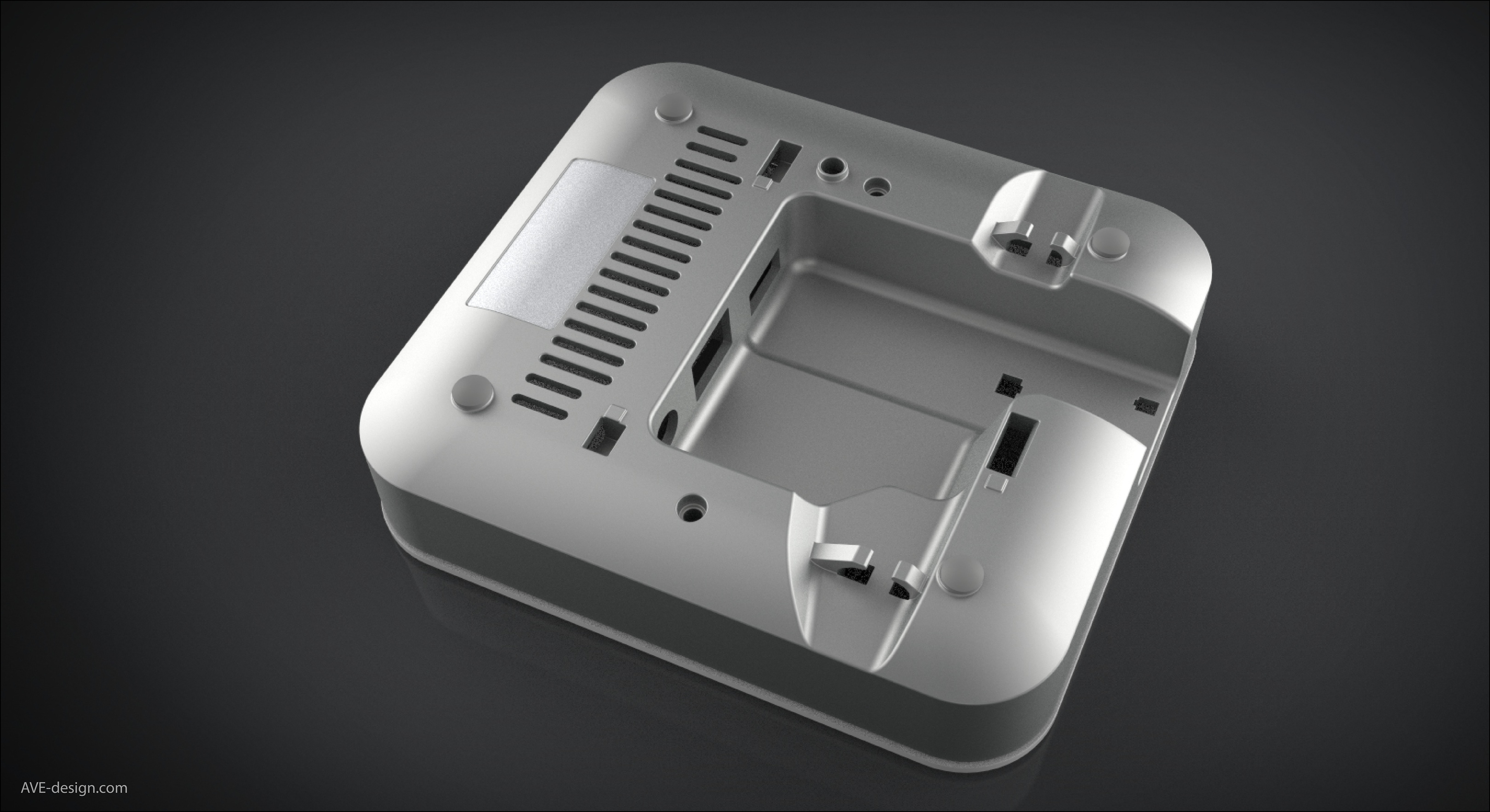
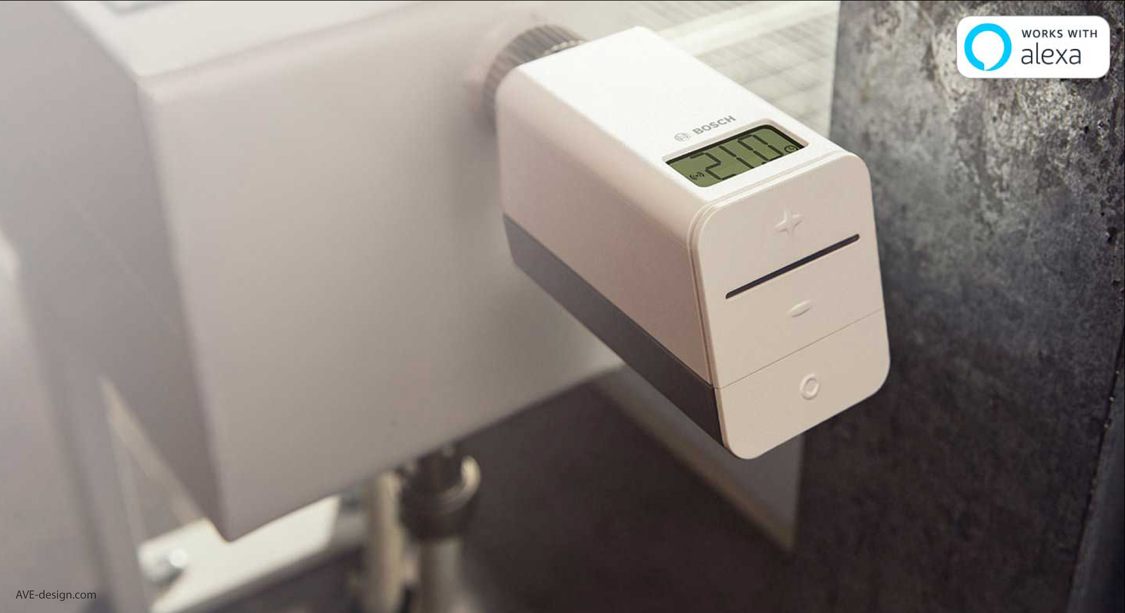
Detailing
I believe you can judge a product by its backside.
The smart home products are not cheap, but nothing screams more design on a budget then an ugly back. I tried to see the product from all sides an not only from the front to show this is well thought out and trustworthy.
The smart home products are not cheap, but nothing screams more design on a budget then an ugly back. I tried to see the product from all sides an not only from the front to show this is well thought out and trustworthy.